Lady Gaga Poster
Fall’22
Advertising | Illustration | Motion
Procreate | Adobe Illustrator | Adobe After Effects
Abstract
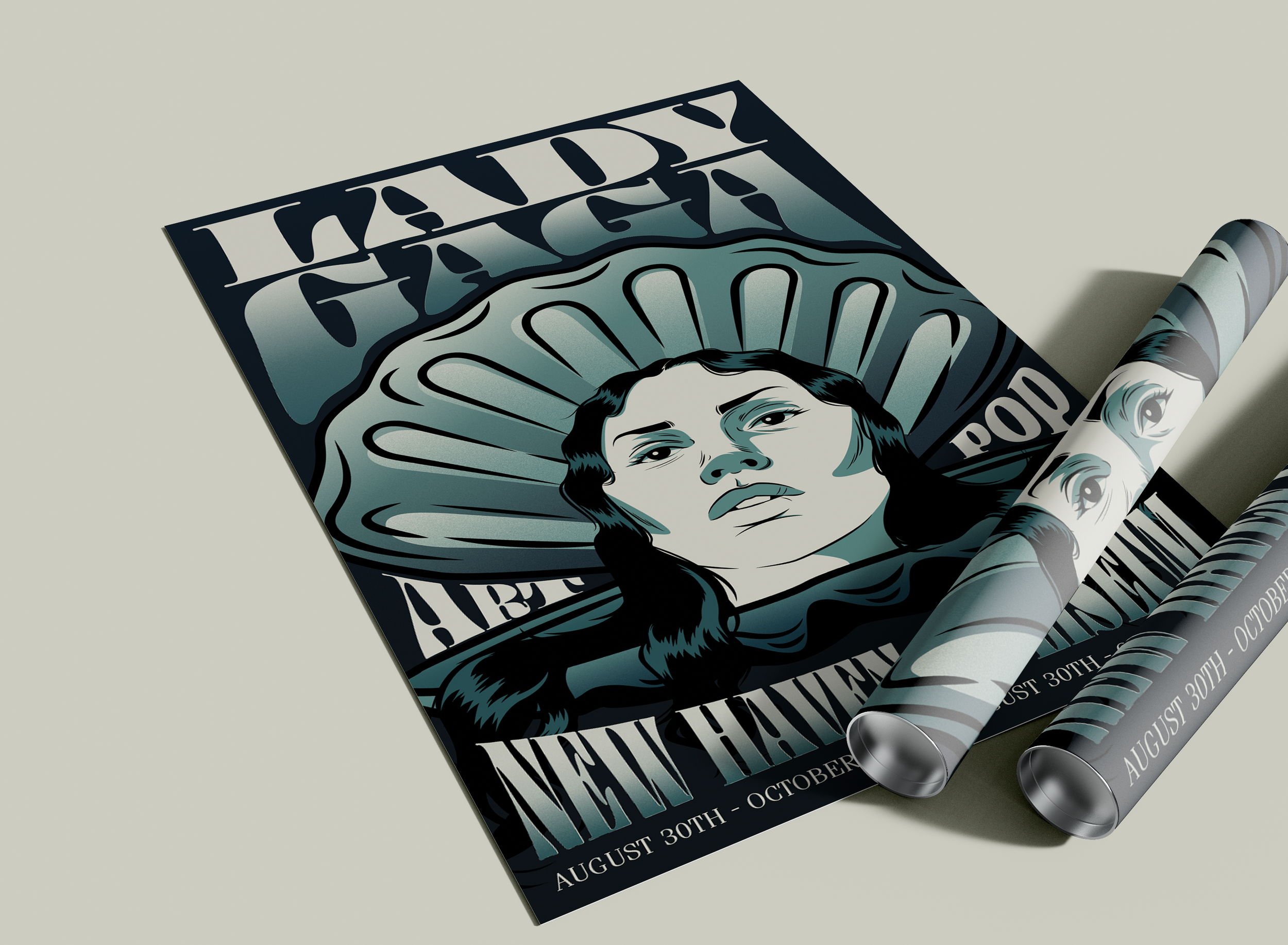
This poster design not only demonstrates advanced skills in establishing a visual hierarchy for a poster but goes beyond by presenting a different poster whether it’s a poster mock-up or a motion graphic. Presenting a sketch from its initial stages to the final printed version.
Process
color palette
pale olive
dusty seafoam
twilight turquoise
peacock midnight
dark sapphire
I chose a monochromatic color palette because they have a nice range of colors from beige to darker color, every color has its main purpose and intentionally serves to create a hierarchy visually appealing poster.
typography
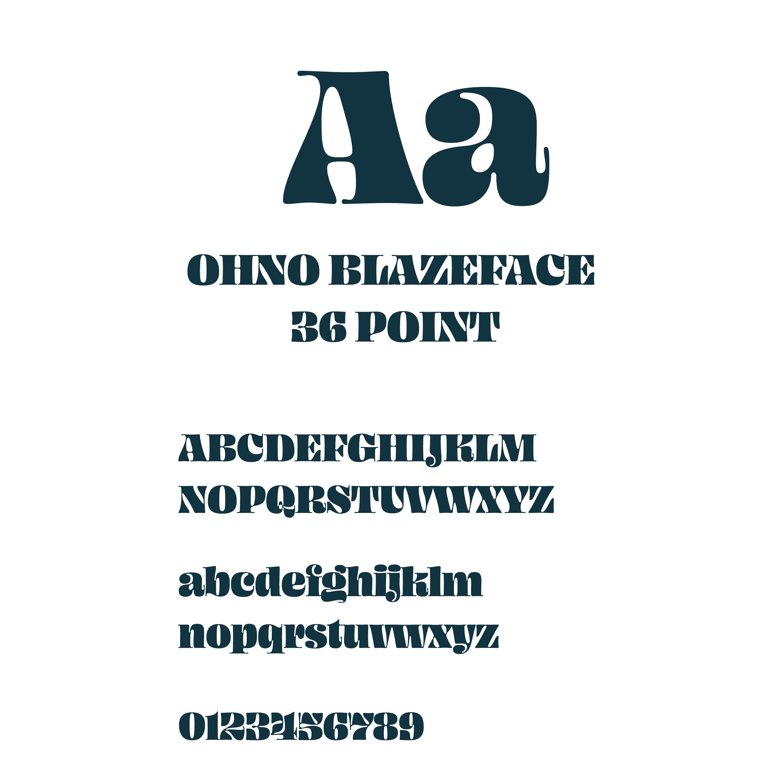
Ohno Blazeface 36-point typeface is chosen for its informative yet playful character, primarily employed in headlines like Lady Gaga, Art Pop, and New Haven Coliseum.
In contrast, Fenice Pro ITC is utilized as the sub-head typeface for conveying additional informative details.
Conclusion
Learning how to multi-use exporting between Illustrator, Photoshop, and After Effects to make variation mock-ups and animations from just one poster. Also, learned how to present my work in different areas of entertainment which are poster design to motion graphics. Utilized free resources to enhance my motion skills.


